Reindesa is evolving both inside and out! In recent months, we’ve been immersed in a brand redefinition process that has culminated in a new visual identity.
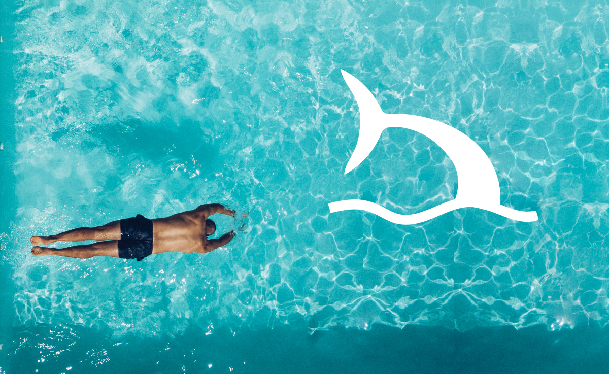
We’ll give you more details later, but here’s the brand’s new identity. It’s an evolution of the iconic swordfish , the company’s emblem for 60 years. We’ve opted for a logo that maintains the same style as the previous one, but with a more modern look.
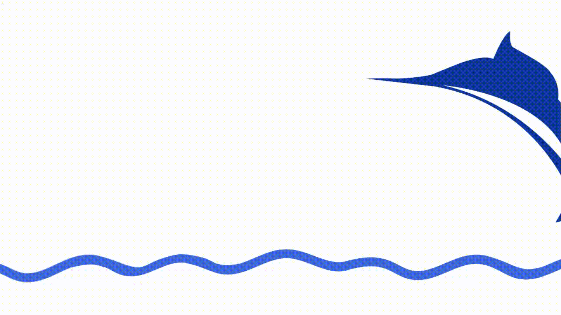
The Reindesa brand was created with a bold, all-caps typeface for a more approachable and modern look. As for the logo, based on the iconic swordfish symbol, the design has been updated and now appears to be swimming underwater .
At Reindesa, we’re committed to ensuring your loved ones enjoy themselves to the fullest , like a fish in water. We trust this logo will accompany us for many years to come, both in our current services and in new ventures.
What do you think? Do you like this evolution?
